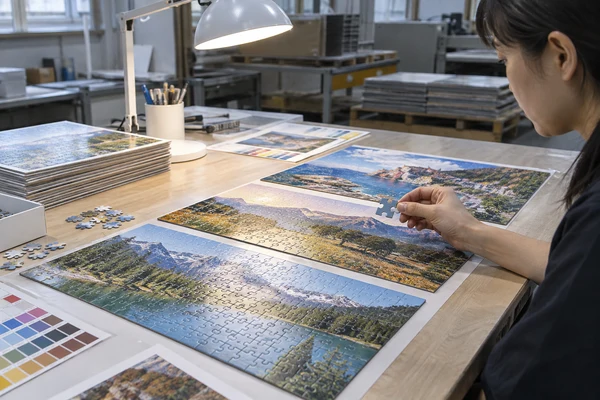
A custom puzzle Pantone color reference can communicate a brand's intended appearance, but it does not automatically mean the finished puzzle will use a separate spot ink or match a screen exactly. First confirm the proposed printing process, substrate and finish, then approve a physical reference with a defined viewing and acceptance method. For a custom branded jigsaw puzzle, this distinction protects brand consistency without creating an impossible promise. This guide focuses on choosing a color acceptance rule for logos, signature backgrounds and coordinated packaging. Our broader color-management guidance covers image preparation; here, the buyer's task is to decide which appearance matters, what evidence represents it and who can authorize a compromise.
Define what brand consistency means for this puzzle
Start by identifying the surfaces that carry a meaningful brand color. A logo on the box lid, a broad background on the puzzle face and a small message on an insert do not necessarily have the same visual priority. Mark the critical areas on a reference PDF so the factory knows where variation would change the intended product application. A general instruction to match every color gives little guidance when photographic artwork includes thousands of tones.
State the viewing situation. A gift box seen under office lighting may look different from the same print beside a bright digital presentation. A museum shop may display several editions together, making differences between boxes more noticeable than differences within one photograph. These are hypothetical applications, not descriptions of completed customer projects. Decide whether consistency between components or closeness to a particular reference is the higher priority.
Ask the brand owner which standard is authorized. A digital brand guide may contain RGB values, CMYK recipes and Pantone names that were developed for different outputs. They are not interchangeable instructions. The packaging designer should clarify the intended reference, its edition and the relevant coated or uncoated designation before production discussions. Resolve conflicting references internally instead of asking the factory to choose the identity of your brand.
Write a usable color brief
A useful brief names the critical patch, identifies the physical reference, states the intended printing surface and appoints the final approver. Include a clear fallback decision if the target cannot be reproduced by the proposed process. That decision might be a reviewed process-color approximation or a redesign, subject to feasibility and quotation.
Distinguish a named color from the printing method
The question can a custom puzzle use Pantone colors needs two answers: can the factory interpret the reference, and can the proposed job actually use the required production method? A spot-color name in an artwork file may be converted to process colors during output. Conversely, an agreed spot ink requires a manufacturing proposal that includes that ink and the relevant printing arrangement. Confirm the proposal in writing.
Pantone's explanation of color spaces distinguishes process-color and spot-color systems. Use that distinction to frame supplier questions rather than treating a conversion value as a guarantee. Some brand colors can be represented acceptably in process printing; others may need a visible compromise. Your physical proof and business priorities determine whether the result is suitable.
For custom puzzle CMYK printing, ask which output condition and file preparation instructions the supplier expects. Do not select a profile solely because it appears in a design application menu. The printer's actual workflow, stock and finishing affect the result. If a separate spot-color option is proposed, clarify whether it applies to the puzzle face, packaging, inserts or only some components.
Keep availability separate from desirability. A technically possible method may change setup, cost, scheduling or component compatibility. A buyer should request a comparison on the same product specification and quantity scenarios. PuzzleZa does not need to promise a particular spot-ink capability for you to create a sensible brief; send the brand reference and requested components for project-specific discussion.
Choose a reference that matches the actual surface
A Pantone guide sample is a reference printed on a defined paper type. A puzzle face laminated to cardboard and a coated retail box are different physical constructions. Surface texture, whiteness and finish can change perceived appearance even when the same underlying artwork is used. Compare the complete proposed construction before deciding that two components should share one numerical target.
Request clarification of the sample's representativeness. A small ink swatch may help evaluate a color direction but does not establish the appearance of a finished puzzle. A digitally produced mock-up may represent layout while differing from the intended print process. Ask what was used to make the proof and which production attributes it represents. Label provisional references clearly so they cannot become accidental approval standards.
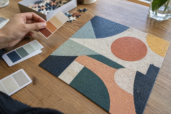
Place the critical colors next to their actual neighbors. A signature blue can appear different beside white, a warm photograph or a black border. Include realistic image context in the proof, especially if the brand color forms a large background. Isolated patches remain useful for measurements, but visual approval should also consider how the buyer's customer will encounter the assembled puzzle and box.
Compare the complete components
For a promotional puzzle kit, review the puzzle, box and reference insert together. Decide which component is the lead visual reference. If perfect cross-material matching is not achievable, document an acceptable relationship rather than leaving three suppliers to interpret the same color independently.
Agree the inspection conditions and acceptance rule
Specify how people will compare samples. Use a consistent neutral viewing environment and avoid mixed lighting, colored reflections or photographs taken under unknown lamps. Keep the reference and candidate on the same plane and view comparable areas. This creates a repeatable visual discussion; it does not establish a certified laboratory procedure or prove the factory uses a particular standardized booth.
If instrumental color assessment is required, the parties need to agree the measurement approach as well as the target. Instrument geometry, illuminant, observer, backing and the chosen color-difference calculation can affect reported values. A tolerance written without those details can cause an argument rather than resolve one. Ask a competent print specialist to define the method appropriate to the job instead of adopting a number from an unrelated product.
Separate measurable acceptance from subjective preferences. A critical logo patch can have a defined comparison method, while a photographic landscape may need image-based approval for balance and detail. Record both. A single numerical result cannot explain whether a portrait appears natural or whether a dark image remains readable after cutting. Custom puzzle color printing should preserve the product's overall purpose as well as brand identity.
| Item | Record before approval | Reason |
|---|---|---|
| Reference | Named physical reference and version | Avoid conflicting color targets |
| Construction | Stock, printed surface and finish | Make proof comparison relevant |
| Viewing | Agreed comparison conditions | Reduce lighting disputes |
| Tolerance | Method and authorized exception | Make the release decision traceable |
Send your brand color requirements
Share the brand guide, critical color areas and intended puzzle and box formats. Ask which proof can represent the proposed construction before approving production.
Check that the released artwork preserves the decision
Once the intended color route is agreed, inspect the actual production files. A designer may have selected a spot swatch while another export converted it to CMYK, or two identically named colors may be duplicated with different definitions. Ask the prepress team to confirm how the relevant separations appear in the final PDF. Preview settings can identify problems, but a preview remains different from a physical print.
Adobe's color-separation guidance describes reviewing the inks used for output. Keep the documented color treatment attached to the approved file rather than relying on a screenshot of a swatch panel. If the printing method changes, review the resulting appearance again because an earlier approval may no longer represent the revised process.
Review logos and small colored lettering at their final size. Thin elements, knockout areas and registration-sensitive combinations deserve a separate legibility check. A brand patch can look acceptable while the text placed over it becomes difficult to read. Inspect the box panels and reference image as well as the puzzle sheet. Use the artwork requirements guide for the broader file checklist.
Prevent unapproved conversion
Record whether each named spot color is retained, converted or used only as a visual reference. Give the final PDF an explicit version identifier and request confirmation when a revised output is required. A filename containing final is not evidence that the correct conversion and approval occurred.
Review proofs with specific, actionable comments
Send consolidated feedback from one authorized contact. Instead of saying that everything looks wrong, identify the affected component and location, compare it with the agreed reference and describe the visible difference. A marked photograph can locate the concern, but it should not replace the physical standard because cameras and displays alter color. Retain the original sample during the discussion.
Use a short decision log for every critical area: accepted, revise, or accepted with a stated exception. Distinguish a correction to the file from a correction to the proposed production process. If the customer requirements changed after the first proof, identify that as a new request. This keeps the discussion factual and allows the factory to assess the effect on sampling and quotation.
Do not approve a proof solely because a launch date is approaching. If the color difference is commercially acceptable, document that acceptance explicitly. If it is not, choose a revised method, new artwork or a delayed release based on the actual alternatives. There is no universal amount of revision that a supplier must include, so confirm the sampling scope before repeated iterations.
A hypothetical approval example
Imagine a brand accepts a process-color approximation for the puzzle photograph but requires a separate review of the signature lid background. The release record should identify those different rules and retain both samples. This example demonstrates an approval structure; it is not a claim about a PuzzleZa customer's project or a promise that separate spot printing is available.
 PuzzleZa
Connect factory testing to the retained color reference
Factory testing should use the approved configuration and the checks agreed for the order. Ask which representative components will be compared, when observations will be recorded and who will resolve an exception. A physical reference needs an identifier that connects it to the file, materials and finish. A loose swatch with no order number cannot explain which puzzle edition it belongs to.
At shipment inspection, compare selected finished packs with the retained reference for the critical brand areas and overall product appearance. Keep the lighting and method reasonably consistent with the approval process. Also check that the correct artwork and packaging versions were used. A technically acceptable color result does not compensate for shipping the wrong design.
Confirm the inspection scope without overclaiming coverage. Selected-unit checks do not mean every pack was individually measured, and a sample report does not guarantee identical appearance under every retail lamp. Review the Shenzhen factory overview as a starting point for discussing the actual order controls. The relevant evidence is the agreed project record, not a general statement of manufacturing professionalism.
Document exceptions before freight handover
If a reviewed production sample differs from the approved reference, record the observation and the buyer's release decision before dispatch. Include photographs for location and a written explanation of the accepted condition. Do not silently replace the original standard; preserve both the standard and the exception so future orders can be evaluated correctly.
Maintain the standard across editions and reorders
Store retained samples away from excessive light, moisture and handling damage, and identify their approval dates. A worn or faded reference may no longer be a fair comparison. Agree how long it will be held and who keeps the buyer and factory copies. Reference management is especially useful when separate editions need to sit together on the same shelf months later.
Review whether the materials, finish, printing method or artwork changed before reordering. Ask for proposed substitutions to be disclosed and evaluated against the retained reference. Do not assume a previously acceptable CMYK recipe will produce the same appearance on a different stock. A new component supplier can also change the visual relationship between the puzzle face and box.
Use the CMYK color-management guide for the underlying image workflow, then attach this article's brand acceptance rules to your next purchase brief. Choose the product format through the custom puzzle range and define the actual surface before requesting a precise color discussion. Clear evidence makes approval more reliable than stronger marketing language.
Hand over the next order cleanly
The reorder packet should contain the approved PDF version, physical reference identifier, critical patch map, finish specification and recorded exceptions. Name the current approver again. A new purchasing contact should be able to understand what was accepted without reconstructing a long email thread or guessing why two similar samples differ.
Frequently asked questions
Does a Pantone number guarantee an exact puzzle color?
No. It communicates a reference, but output depends on the agreed printing method, material and finish. Confirm whether the job uses a spot ink or a process-color simulation, then approve a representative physical result under an agreed comparison method.
Should puzzle artwork and packaging share one color tolerance?
Not automatically. Different surfaces and finishes can change appearance. Decide whether cross-component harmony or a reference patch is the priority, and define appropriate checks for each component. Review the complete pack together before releasing the files.
Can a screenshot approve a critical brand color?
A screenshot can help identify an area but is weak evidence for physical color acceptance. Displays, cameras and viewing conditions differ. Use an identified physical reference for critical areas and retain the written decision alongside the production file.
What if the proposed CMYK result is outside brand expectations?
Ask the supplier to explain feasible alternatives and their scope. Options may include an accepted approximation, revised artwork or another printing arrangement if available. The authorized brand owner should accept the chosen route; no alternative should be assumed available or free.
How should color approval be recorded for reorders?
Keep the file version, material and finish, physical reference, viewing method, critical areas and exceptions together. Review any proposed changes before repeat production. Retained samples need suitable storage because damage or fading can undermine their usefulness as standards.
Conclusion
Branded puzzle color approval works best when the buyer separates the color reference, production method and acceptance evidence. Define the important areas, compare representative finished materials and record authorized compromises. A clear retained standard helps printing, packaging and purchasing teams make consistent decisions without promising an exact match that the process cannot support.
Plan a practical branded puzzle approval
Contact PuzzleZa with artwork status, quantity scenarios and color priorities. We can discuss the project brief and the evidence you need for a responsible release decision.
Sources and scope
Sources reviewed on 2026-10-09. Manufacturing examples and review checklists are planning guidance, not claims about completed customer projects or guaranteed results. AI-generated images illustrate the topic and do not document an actual inspection.
- Pantone: What Are Your Color Spaces? — Difference between spot and process-color systems.
- Adobe: Prepare documents for color separation — Review ink separations in production files.